Color Palette Generation
Color Palette Generation
Color Palette Generation
April 3rd 2023 with GPT-4
April 3rd 2023 with GPT-4
April 3rd 2023 with GPT-4
tl;dr
tl;dr
tl;dr
I asked chatgpt to help me create a subtle color palette, that fits the style of typical wabi sabi interior for one of our clients.
After a few iterations, GPT4 came up with a solid, harmonious and suitable palette of 6 colors
Even provided interesting color names, without me asking
The palette would need to be fine tuned, but it's a good starting point
***
hej, I would like to create a color palette for a restaurant client of our design studio. the restaurant interior mostly uses wabi sabi colors. could you please provide some suitable hex values with matching colors?
Of course! Wabi Sabi is a Japanese aesthetic concept that embraces imperfection, simplicity, and the natural beauty of materials. Earthy and natural colors are often associated with Wabi Sabi. Here's a color palette with hex values that would suit a Wabi Sabi-inspired restaurant interior: Warm Beige: #D3B897 Soft Gray: #A9A9A9 Light Taupe: #B0A390 Deep Green: #4B5848 Rusty Red: #A8513A Muted Mustard: #D1B064 Off-White: #F7F4ED Charcoal Gray: #4D4D4D Aged Copper: #9D8B75 Earthy Brown: #7A5D46 You can use these colors as a starting point and adjust them according to your client's preferences and the specific design requirements of the restaurant. Keep in mind the balance between light and dark tones to create a harmonious and cozy atmosphere.

Let's create the harmonious palette together. the brand colors should be limited to 5 and work well together, as it's necessary for every good visual identity. Can you also represent these colors as images?
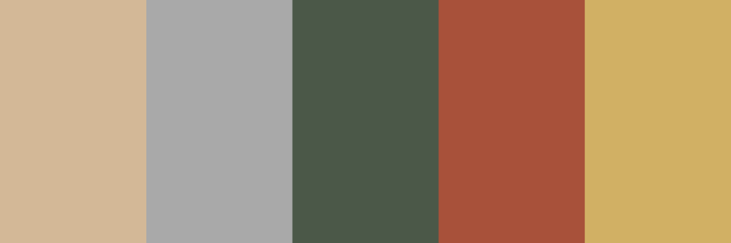
Certainly! Here's a harmonious color palette with 5 colors that complement each other well, based on the Wabi Sabi aesthetic: Warm Beige: #D3B897 Soft Gray: #A9A9A9 Deep Green: #4B5848 Rusty Red: #A8513A Muted Mustard: #D1B064 Unfortunately, as a text-based AI, I am unable to provide visual representations of these colors directly. However, you can use an online color picker or graphic design software like Adobe Photoshop or Illustrator to create color swatches using the hex codes provided. Here's a suggestion for how you might use these colors in your branding: Warm Beige (#D3B897): Use as a primary background color or for large areas, creating a warm and inviting atmosphere. Soft Gray (#A9A9A9): Utilize for secondary backgrounds or text to add contrast and readability. Deep Green (#4B5848): Employ as an accent color for elements such as icons, headings, or borders to evoke the natural essence of Wabi Sabi. Rusty Red (#A8513A): Apply sparingly to emphasize specific elements or create focal points that convey warmth and earthiness. Muted Mustard (#D1B064): Incorporate as a secondary accent color for highlights or
I think, following the wabi sabi concept, the colors are slightly too saturated overall. Please make it more subtle.
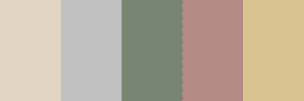
I understand your concern. Here's a revised Wabi Sabi-inspired color palette with more subtle and desaturated colors: Pale Beige: #E2D6C2 Light Gray: #C1C1C1 Muted Sage Green: #798573 Dusty Rose: #B48A84 Subtle Ochre: #D8C48F These colors provide a softer, more subdued representation of the Wabi Sabi aesthetic while still maintaining a harmonious balance. You can use this updated palette in your branding or further adjust the colors to better suit your client's preferences.
I think we're on the right way here. I think it's still too saturated and fore and background colors don't have enough contrast.
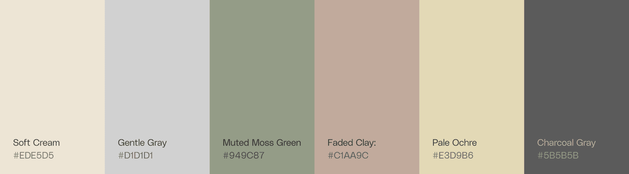
I appreciate your feedback. Here's another revised Wabi Sabi-inspired color palette with even more desaturated colors and improved contrast between foreground and background colors: Soft Cream: #EDE5D5 Gentle Gray: #D1D1D1 Muted Moss Green: #949C87 Faded Clay: #C1AA9C Pale Ochre: #E3D9B6 This palette should provide a better balance between subtlety and contrast while still reflecting the Wabi Sabi aesthetic. Feel free to use these colors as a starting point and adjust them further as needed to suit your client's preferences and specific design requirements.
let's add another dark color that fits in the palette, which we could use as text color.
Of course! Adding a darker color for better readability in text is a great idea. Here's a suitable color that complements the revised Wabi Sabi-inspired color palette: Charcoal Gray: #5B5B5B This dark, desaturated gray works well with the existing colors while providing enough contrast for legible text. Your updated palette now includes: Soft Cream: #EDE5D5 Gentle Gray: #D1D1D1 Muted Moss Green: #949C87 Faded Clay: #C1AA9C Pale Ochre: #E3D9B6 Charcoal Gray: #5B5B5B Use this palette as a basis for your design, and feel free to make any further adjustments as needed to meet your client's preferences and the specific requirements of the project.
Looks good! Finally, let's slightly change the order of the colors, to better follow a visual harmony. Put the lightest colors on the left, darker on the right.
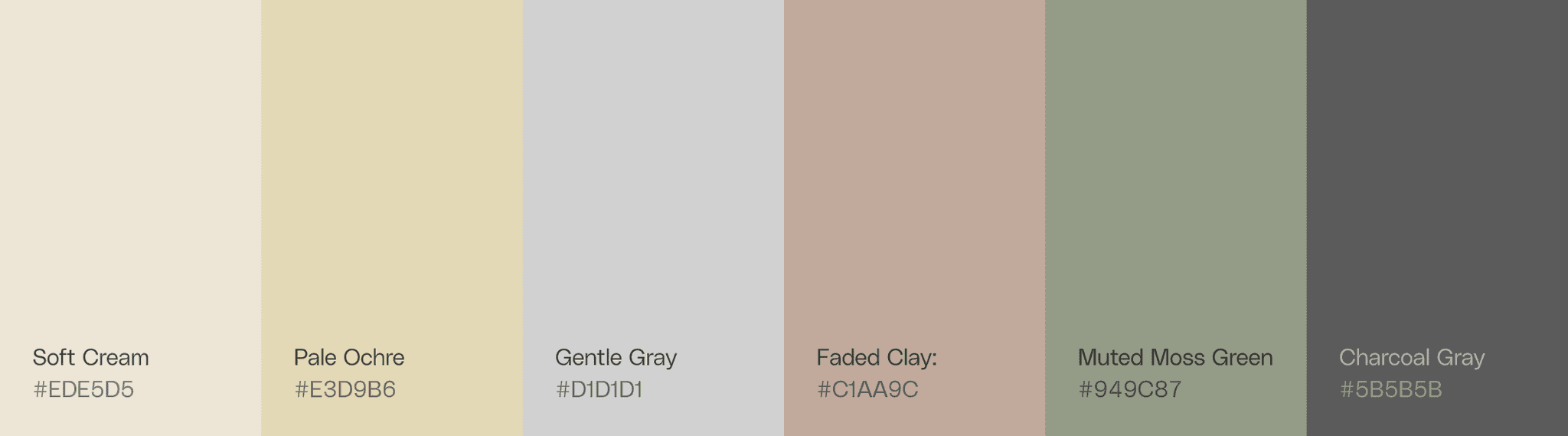
Certainly! Here's the updated Wabi Sabi-inspired color palette with the colors arranged from lightest to darkest for better visual harmony: Soft Cream: #EDE5D5 Pale Ochre: #E3D9B6 Gentle Gray: #D1D1D1 Faded Clay: #C1AA9C Muted Moss Green: #949C87 Charcoal Gray: #5B5B5B This arrangement should provide a visually harmonious and balanced palette for your design. You can use these colors as a starting point and adjust them further as needed to meet your client's preferences and the specific requirements of the project.
Do you think Gentle Gray really fits well in this palette?
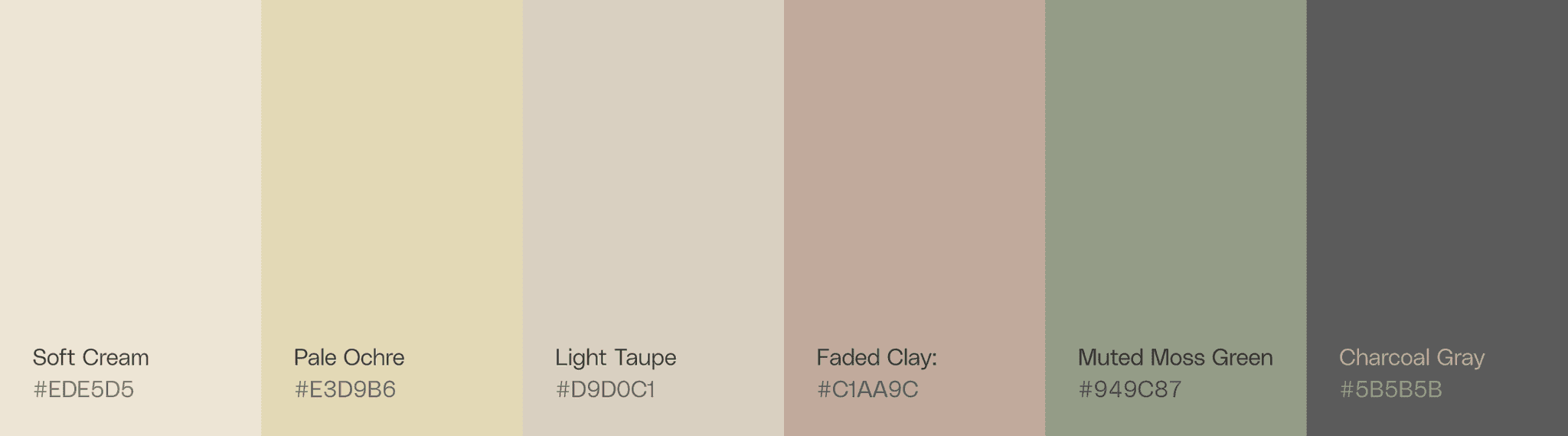
I understand your concern. If you think Gentle Gray isn't fitting well with the rest of the colors in the palette, you might consider replacing it with another color that complements the existing colors. Here's a suggestion: Replace Gentle Gray (#D1D1D1) with: Light Taupe: #D9D0C1 The updated palette would look like this: Soft Cream: #EDE5D5 Pale Ochre: #E3D9B6 Light Taupe: #D9D0C1 Faded Clay: #C1AA9C Muted Moss Green: #949C87 Charcoal Gray: #5B5B5B This Light Taupe color has a slightly warmer hue compared to Gentle Gray, which should help it blend more harmoniously with the rest of the Wabi Sabi-inspired palette. Feel free to use this adjusted palette as a starting point and make any further changes as needed to satisfy your client's preferences and the specific requirements of the project.
I think we've got it, thank you (:
You're welcome! I'm glad we found a suitable color palette for your project. If you have any more questions or need further assistance, please don't hesitate to ask. Good luck with your design project, and I hope your client loves the result!
***
***
hej, I would like to create a color palette for a restaurant client of our design studio. the restaurant interior mostly uses wabi sabi colors. could you please provide some suitable hex values with matching colors?
Of course! Wabi Sabi is a Japanese aesthetic concept that embraces imperfection, simplicity, and the natural beauty of materials. Earthy and natural colors are often associated with Wabi Sabi. Here's a color palette with hex values that would suit a Wabi Sabi-inspired restaurant interior: Warm Beige: #D3B897 Soft Gray: #A9A9A9 Light Taupe: #B0A390 Deep Green: #4B5848 Rusty Red: #A8513A Muted Mustard: #D1B064 Off-White: #F7F4ED Charcoal Gray: #4D4D4D Aged Copper: #9D8B75 Earthy Brown: #7A5D46 You can use these colors as a starting point and adjust them according to your client's preferences and the specific design requirements of the restaurant. Keep in mind the balance between light and dark tones to create a harmonious and cozy atmosphere.
Let's create the harmonious palette together. the brand colors should be limited to 5 and work well together, as it's necessary for every good visual identity. Can you also represent these colors as images?
Certainly! Here's a harmonious color palette with 5 colors that complement each other well, based on the Wabi Sabi aesthetic: Warm Beige: #D3B897 Soft Gray: #A9A9A9 Deep Green: #4B5848 Rusty Red: #A8513A Muted Mustard: #D1B064 Unfortunately, as a text-based AI, I am unable to provide visual representations of these colors directly. However, you can use an online color picker or graphic design software like Adobe Photoshop or Illustrator to create color swatches using the hex codes provided. Here's a suggestion for how you might use these colors in your branding: Warm Beige (#D3B897): Use as a primary background color or for large areas, creating a warm and inviting atmosphere. Soft Gray (#A9A9A9): Utilize for secondary backgrounds or text to add contrast and readability. Deep Green (#4B5848): Employ as an accent color for elements such as icons, headings, or borders to evoke the natural essence of Wabi Sabi. Rusty Red (#A8513A): Apply sparingly to emphasize specific elements or create focal points that convey warmth and earthiness. Muted Mustard (#D1B064): Incorporate as a secondary accent color for highlights or
I think, following the wabi sabi concept, the colors are slightly too saturated overall. Please make it more subtle.
I understand your concern. Here's a revised Wabi Sabi-inspired color palette with more subtle and desaturated colors: Pale Beige: #E2D6C2 Light Gray: #C1C1C1 Muted Sage Green: #798573 Dusty Rose: #B48A84 Subtle Ochre: #D8C48F These colors provide a softer, more subdued representation of the Wabi Sabi aesthetic while still maintaining a harmonious balance. You can use this updated palette in your branding or further adjust the colors to better suit your client's preferences.
I think we're on the right way here. I think it's still too saturated and fore and background colors don't have enough contrast.
I appreciate your feedback. Here's another revised Wabi Sabi-inspired color palette with even more desaturated colors and improved contrast between foreground and background colors: Soft Cream: #EDE5D5 Gentle Gray: #D1D1D1 Muted Moss Green: #949C87 Faded Clay: #C1AA9C Pale Ochre: #E3D9B6 This palette should provide a better balance between subtlety and contrast while still reflecting the Wabi Sabi aesthetic. Feel free to use these colors as a starting point and adjust them further as needed to suit your client's preferences and specific design requirements.
let's add another dark color that fits in the palette, which we could use as text color.
Of course! Adding a darker color for better readability in text is a great idea. Here's a suitable color that complements the revised Wabi Sabi-inspired color palette: Charcoal Gray: #5B5B5B This dark, desaturated gray works well with the existing colors while providing enough contrast for legible text. Your updated palette now includes: Soft Cream: #EDE5D5 Gentle Gray: #D1D1D1 Muted Moss Green: #949C87 Faded Clay: #C1AA9C Pale Ochre: #E3D9B6 Charcoal Gray: #5B5B5B Use this palette as a basis for your design, and feel free to make any further adjustments as needed to meet your client's preferences and the specific requirements of the project.
Looks good! Finally, let's slightly change the order of the colors, to better follow a visual harmony. Put the lightest colors on the left, darker on the right.
Certainly! Here's the updated Wabi Sabi-inspired color palette with the colors arranged from lightest to darkest for better visual harmony: Soft Cream: #EDE5D5 Pale Ochre: #E3D9B6 Gentle Gray: #D1D1D1 Faded Clay: #C1AA9C Muted Moss Green: #949C87 Charcoal Gray: #5B5B5B This arrangement should provide a visually harmonious and balanced palette for your design. You can use these colors as a starting point and adjust them further as needed to meet your client's preferences and the specific requirements of the project.
Do you think Gentle Gray really fits well in this palette?
I understand your concern. If you think Gentle Gray isn't fitting well with the rest of the colors in the palette, you might consider replacing it with another color that complements the existing colors. Here's a suggestion: Replace Gentle Gray (#D1D1D1) with: Light Taupe: #D9D0C1 The updated palette would look like this: Soft Cream: #EDE5D5 Pale Ochre: #E3D9B6 Light Taupe: #D9D0C1 Faded Clay: #C1AA9C Muted Moss Green: #949C87 Charcoal Gray: #5B5B5B This Light Taupe color has a slightly warmer hue compared to Gentle Gray, which should help it blend more harmoniously with the rest of the Wabi Sabi-inspired palette. Feel free to use this adjusted palette as a starting point and make any further changes as needed to satisfy your client's preferences and the specific requirements of the project.
I think we've got it, thank you (:
You're welcome! I'm glad we found a suitable color palette for your project. If you have any more questions or need further assistance, please don't hesitate to ask. Good luck with your design project, and I hope your client loves the result!
***